Case Study: Brand Identity Design for Miracle Mile Community Practice
THE ASK
Design a new logo, website, and updated brand collateral for Miracle Mile Community Practice, a Los Angeles-based community mental health clinic and training site.
BACKGROUND
Founded in 1999, nonprofit Miracle Mile Community Practice (MMCP) provides affordable counseling services in LA’s historic district that shares their name. MMCP also offers educational programing for practitioner trainees specializing in narrative therapy. Their existing logo was outdated and did not reflect MMCP’s level of experience and professionalism. The coordinating website also needed an update, particularly around functionality and accessibility.
THE OLD LOGO

The original logo was black and white, outdated, and as shown above, a high-resolution version of the file no longer existed. The client did feel that the symbol had potential — they explained that the S-shaped graphic to the left of the name was intended to represent a road or journey. While execution-wise there was room for improvement, conceptually this “road” element became a driving theme in the rebrand.
INITIAL CONCEPTS


My early sketches focussed on a few key themes including the aforementioned road/journey, as well as the idea of a story or book (in reference to ‘narrative’ therapy), some kind of weaving or unraveling, writing, and even an elephant. Crafting a monogram from the double M in Miracle Mile felt like a natural place to house the concept, although the sketching process did conjure not-to-distant memories of designing the Michael Phelps Foundation logo.

The initial draft presentation included vectorized versions of the themes I felt worked best conceptually paired with initial typography and color explorations. The client had expressed an interest in tying the new mark both to the Art Deco architecture in LA’s Miracle Mile neighborhood as well as the physical clinic’s Midcentury interior design. All with a contemporary spin, of course!

After reviewing the initial drafts with the client, I honed in on exploring more of the road/journey theme, still utilizing an M (or MM) as an anchor for the concept. We also started to narrow down the color palette with a soothing, California coast-inspired focus on shades of marine blue, sage green, and tan.

From the initial drafts, there was one typeface that rose to the top for me, and happily the client agreed. Named Lagu Sans, it’s described by MyFonts.com as “a contemporary typeface that blends a geometric inspiration with a charming contrast between thick and thin strokes.” In fact, I may have become a little obsessed with high contrast sans serifs during this process. But it’s all good because Lagu Sans really worked well for the vaguely retro/vaguely contemporary vibe we were going for and was lovely in all caps which presented a clean look for the logo given the longer name of the organization.
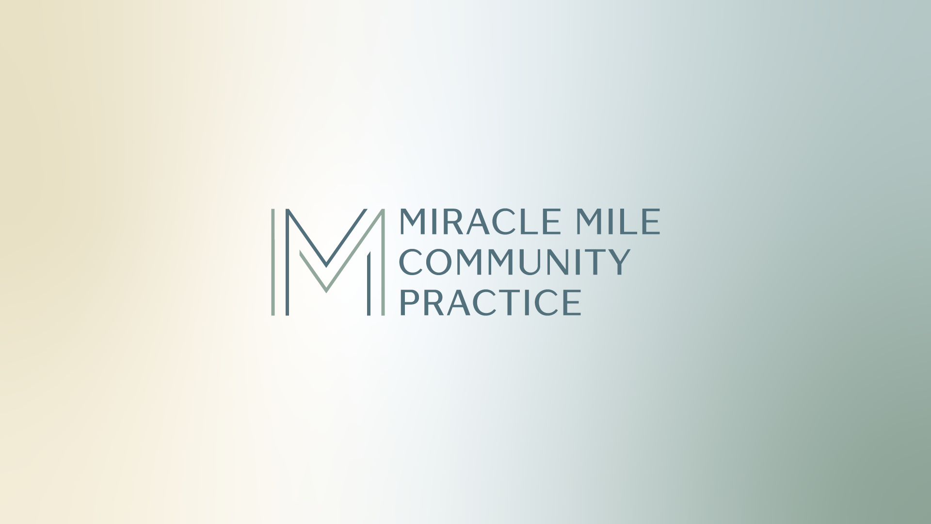
THE FINAL DESIGN

Once a final logo lockup was approved, I expanded the mark into some alternate layouts with social media and signage in mind. From there, I worked with the client to develop updated stationery, business cards, and other branded collateral. (Note that you can view my portfolio page for this project by clicking here.)


THE WEBSITE
After careful consideration, the client decided to move ahead with me designing a Squarespace website, which would guarantee them a responsive design, fit their budget, and enable ease of use for their internal team to update after the site went live. Another priority was maintaining their online presence, so we partnered with SEO expert, Ed Harris to help migrate search engine traction from the old site to the new. They also worked with a professional photographer for updated images of the office and team members, and I sourced budget-friendly, creative commons stock imagery where there were holes to fill. A key feature in the design of the new site was finding the perfect “road” image for the home page to round out the journey concept.
