Case Study: Brand Identity Design for The Panel
THE ASK
Design a logo, brand collateral, packaging, marketing materials, and signage for The Panel, a Sonoma-based “global wines” club and tasting lounge.
BACKGROUND
Nestled in the heart of California wine country, The Panel was a new take on the traditional wine club and lounge. Each month a “panel” of sommeliers blind-tasted a flight of international wines and that month’s wine club selection was determined by their notes (which were also included in each shipment.) For the brick-and-mortar location, wines were available for purchase or tasting, and the in-shop signage included the sommeliers’ notes.
KEY WORDS
As part of the initial strategy and research phase of the project, the client and I identified the following key words to drive the brand update: Wine, Global/International, Informative, Intellectual, and Approachable. We also discussed the architecture and interior of the physical shop since that was already in progress. The client had lots of rustic wood and clean-lined metal in the shop and hoped for that to be factored into the brand identity.
INITIAL CONCEPTS

My first round of drafts were rough! I hesitated to share the above because I can see how far I missed the mark. That being said, missteps are an important and informative part of the design process. I appreciate how far I’ve come with my work since I designed these drafts in 2017 — yay for progress! In any case, these initial drafts focused mostly on the literal “panel” of sommeliers (hence the heads) as well as the wine tasting experience (swirl/speech bubble) and variety of wines offered (varying bottle shapes.) The client politely asked me to go back to the drawing board, but they did feel there was potential in the last option, with the architectural typeface and varying wine bottle shapes in the negative space.

I focused on the wine bottle graphic and incorporated a tagline, since I knew the final mark would need one. I realized what made the brand special to the target audience was the ‘global wines’ offering — in Sonoma, there are countless locally-grown wine shops and tasting rooms because that drives tourism. But for the folks who live there, the international wine offerings were what made The Panel distinct.
REFINEMENTS

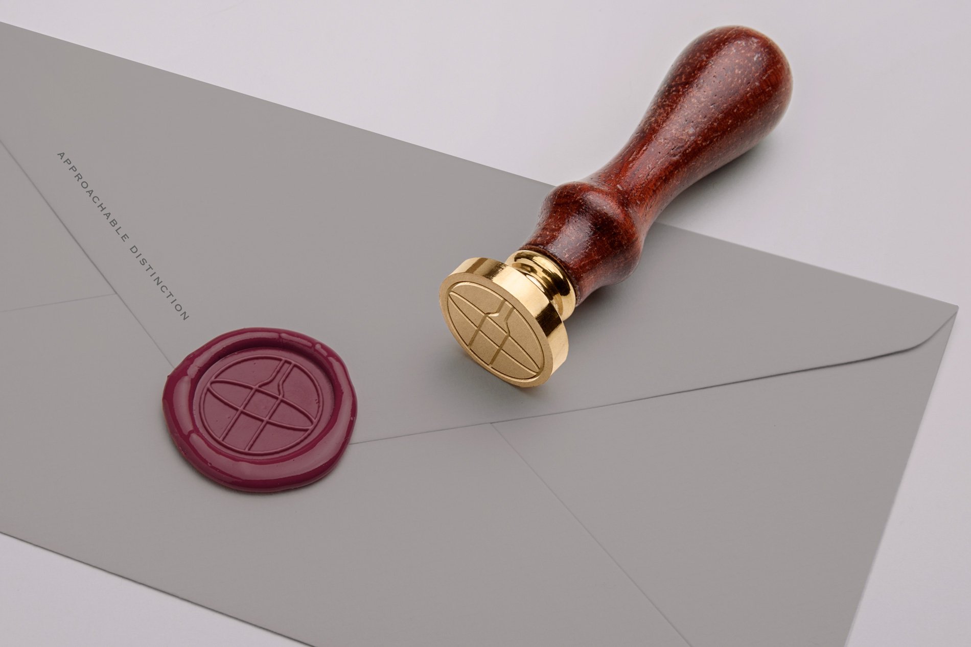
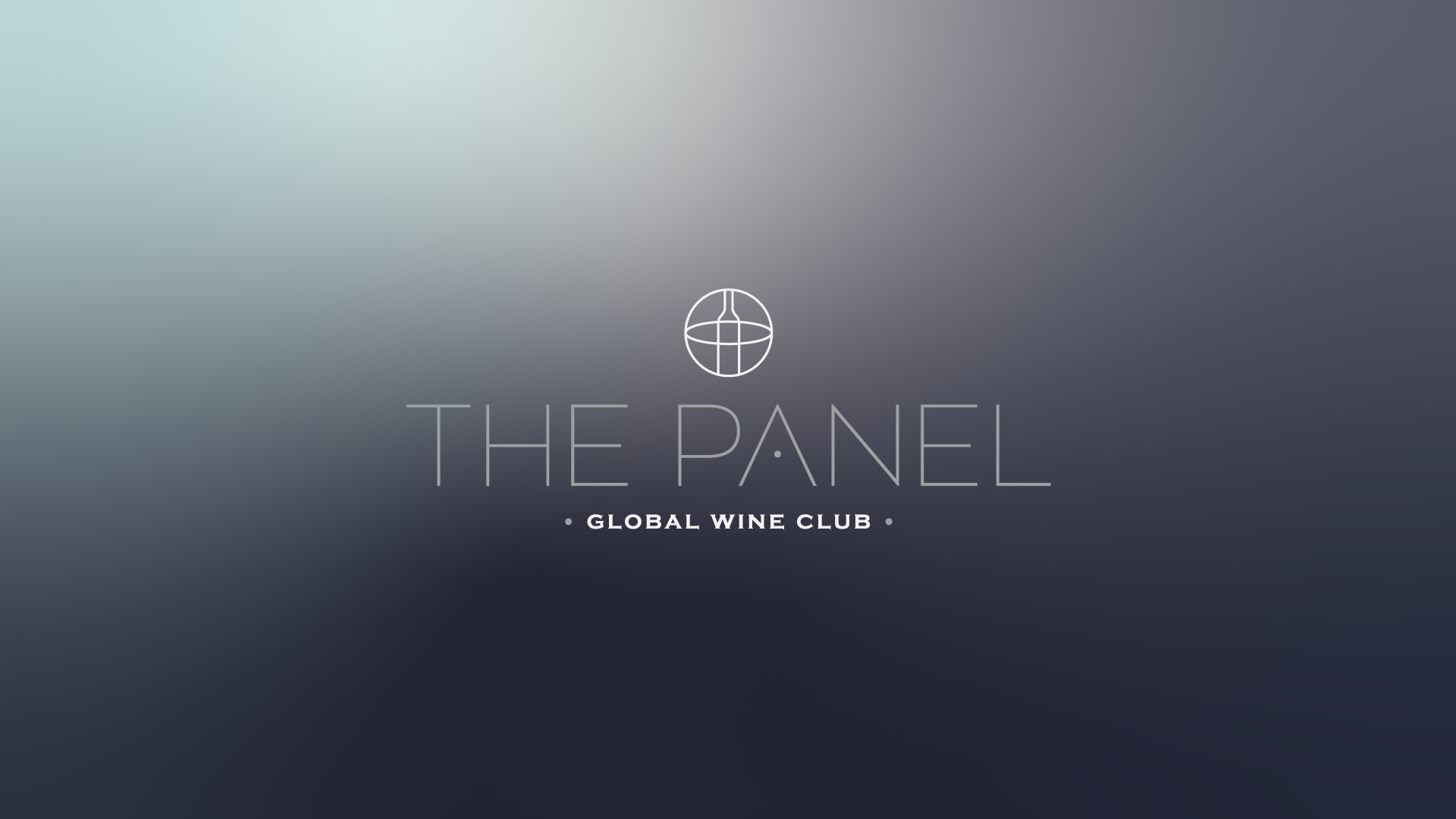
The ‘global wines’ theme rose to the top and I began to hone in on crafting just the right lockup and color scheme, while also pairing with the client’s final tagline. We reviewed several iterations of the globe icon to determine how much vs. how little line-work we could show to have it still read as both globe and wine bottle.

Further refinements presented layout options with and without the tagline. The client and I also discussed the rather ‘thin’ weight of the logotype and determined we would need a bolder version for certain collateral, such as signage.
THE FINAL DESIGN

Once a final logo lockup was approved, I expanded the mark into some alternate layouts with social media and signage in mind. From there, I worked with the client to develop brand stationery, marketing materials including a club journal and tasting notes, business cards, and shipment packaging. To view my portfolio page for this project, please click here.