Case Study: Outreach Toolkit for the Maine Summer Food Program
THE ASK
Design an outreach toolkit including a new logo and original illustration series for the Maine Department of Education’s Summer Food Program to help them promote their services to youth who need to access to meals when school is not in session.
CHALLENGES & OPPORTUNITIES

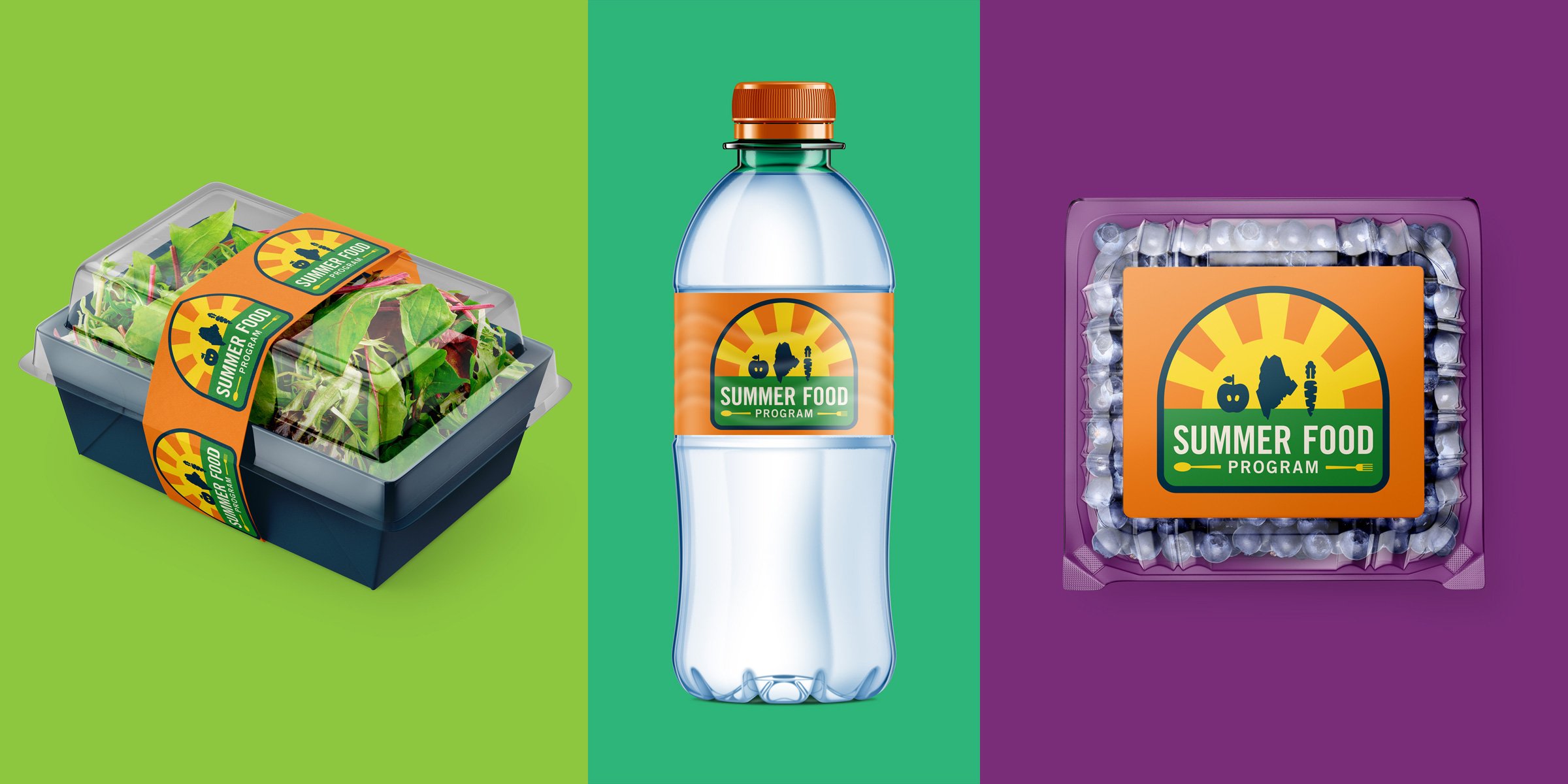
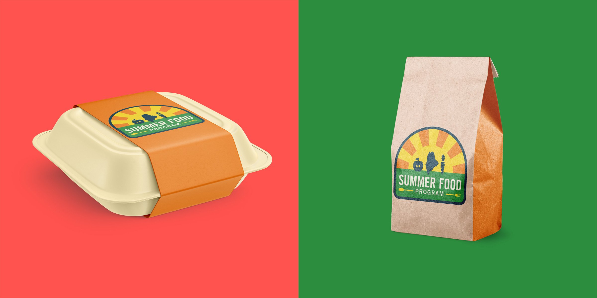
The State of Maine has multiple programs that provide food for people in need, some of which work in tangent with the Summer Food Program (SFP), and others that have funding parameters limiting allocation. There was confusion around who SFP’s free meals were accessible to and where/when pickups were offered. Furthermore, the existing outreach materials were lacking in effectiveness. They had a program logo made up of generic clip-art and some small signage that included illegible hand-written information. The State’s partner programs that SFP was sometimes-paired with had more access to professional design services in the past, but SFP needed their own distinct brand and marketing tools to underscore their summer and youth focus, as well as their connection to schools. The graphics I was tasked to create would be available for download on their website and applied to community outreach materials ranging from social media posts to printed signage, packaging, and swag to promote their services.
THEMES
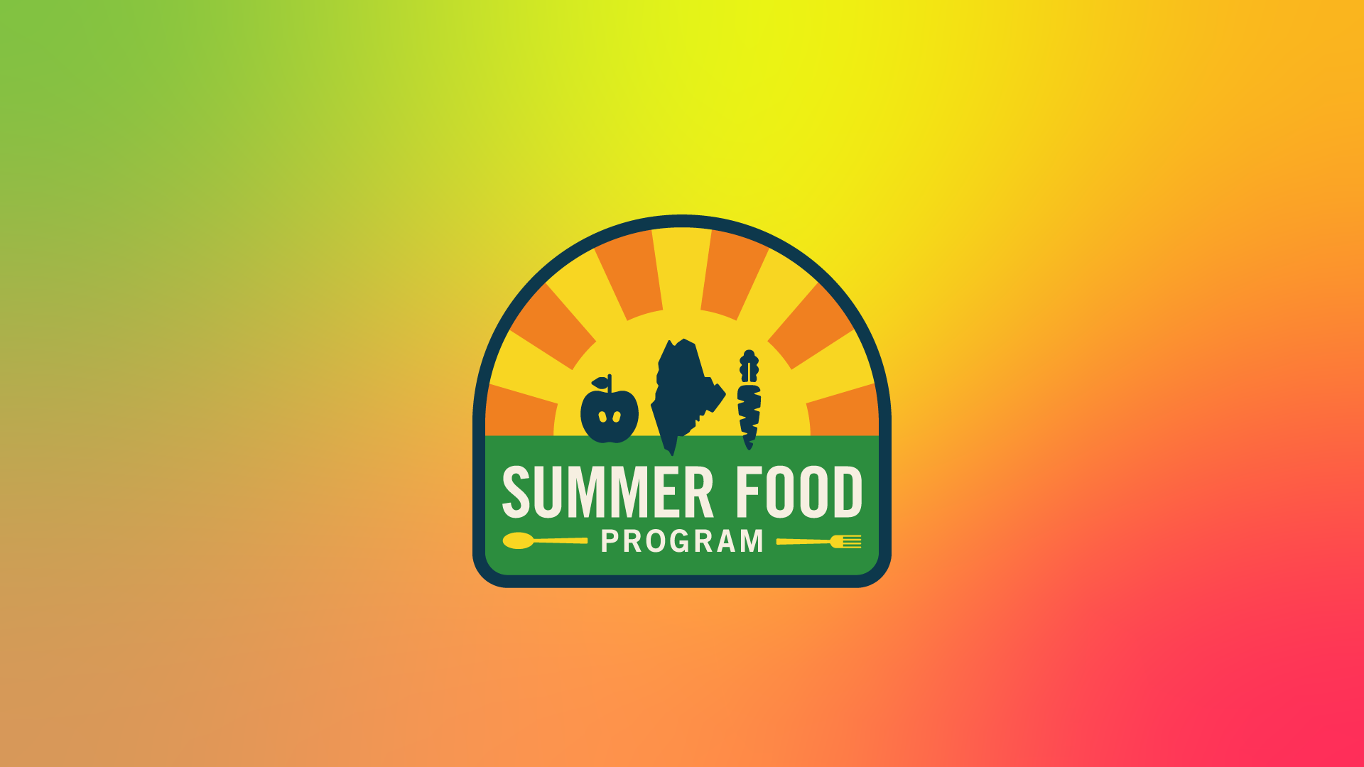
As part of the initial strategy and research phase of the project, the client and I discussed several themes to drive the graphic assets. We unpacked the existing program logo, which featured a pale yellow sun beneath a book (this represented the Department of Education), a carrot (someone in the program’s past had declared this ‘the perfect food’) and dining utensils (which the client said had to stay). Nowhere did the logo show or say “Maine” nor was it easy to use on collateral with its five colors and lack of a vectorized digital file.
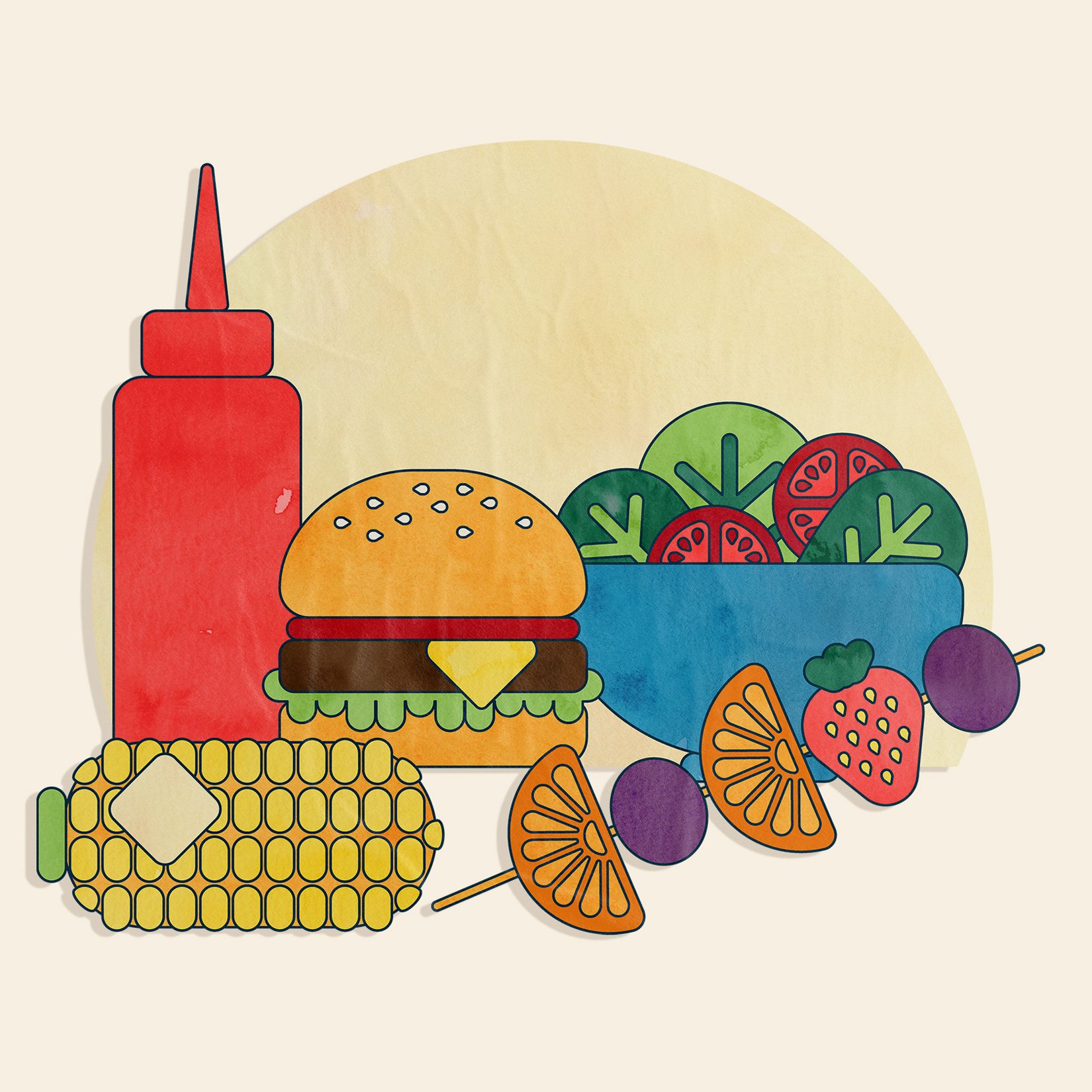
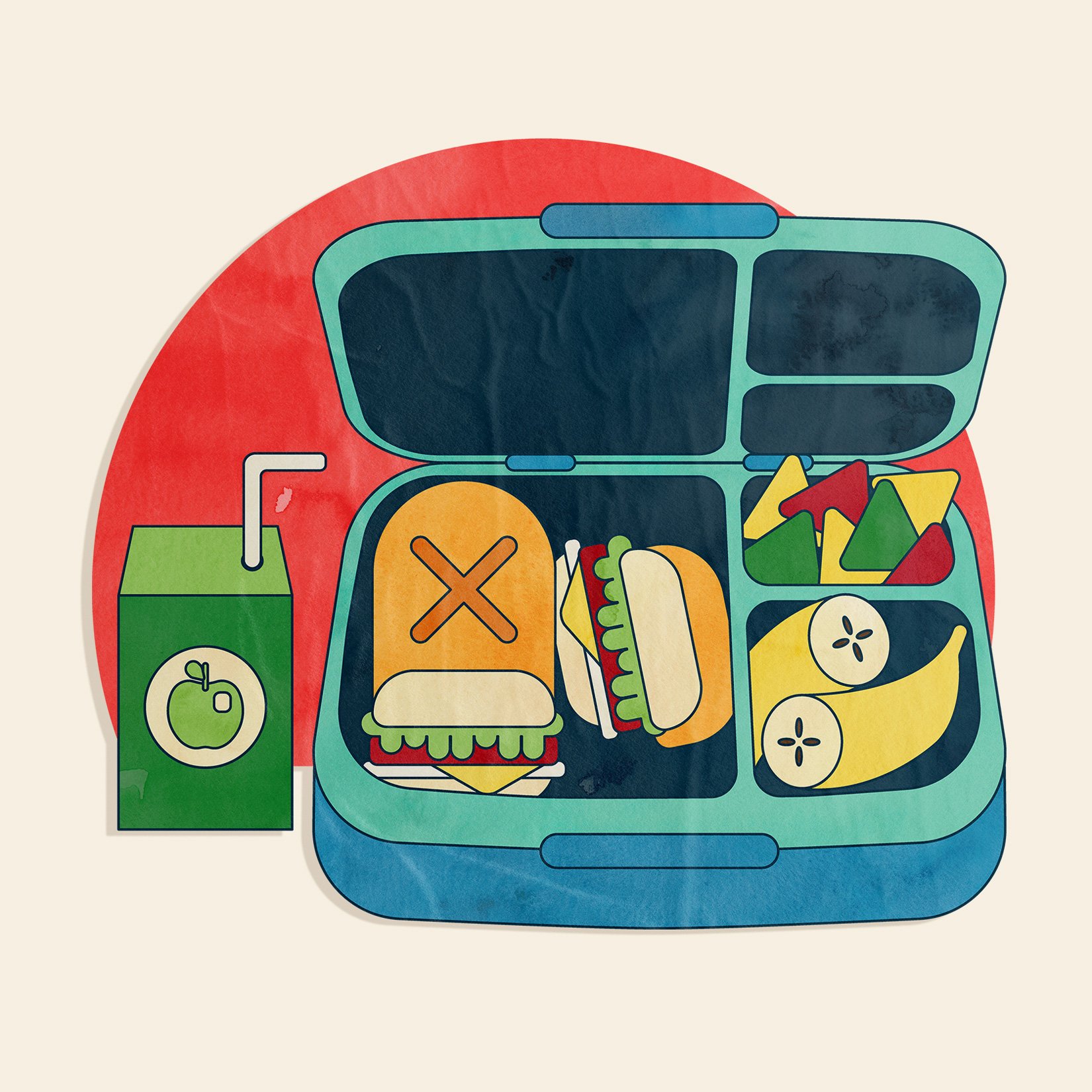
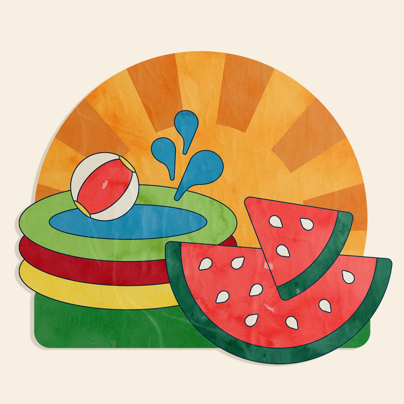
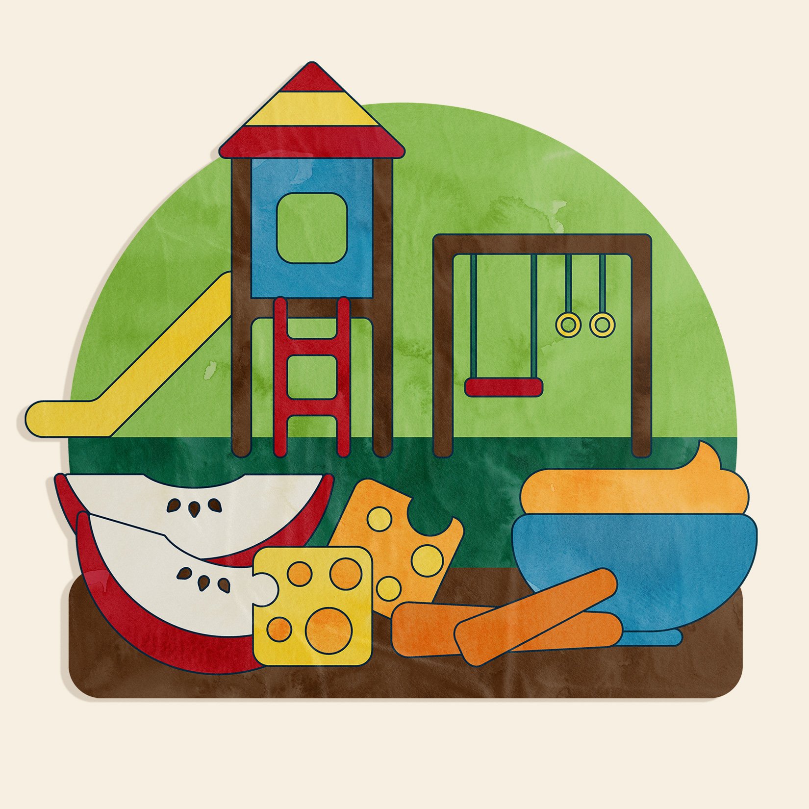
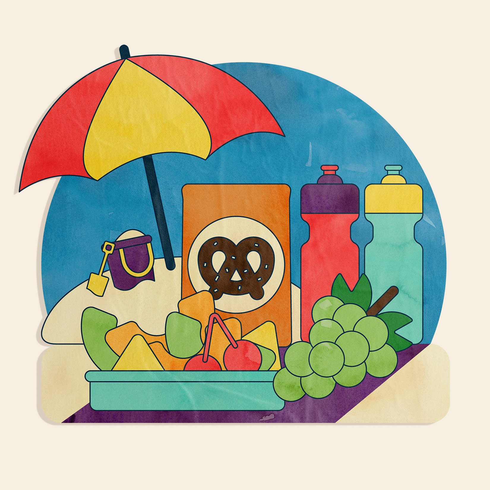
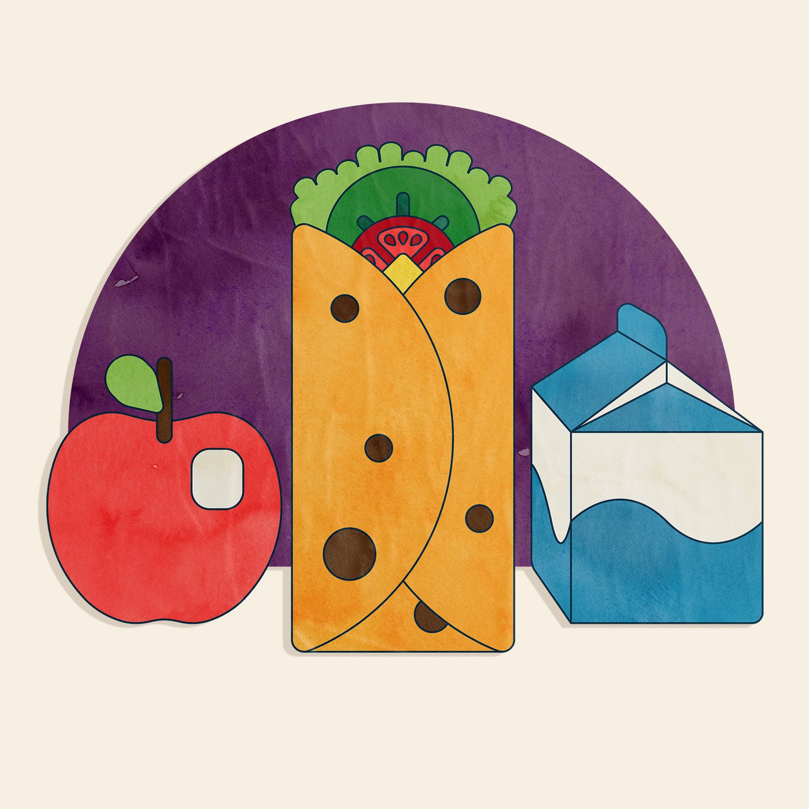
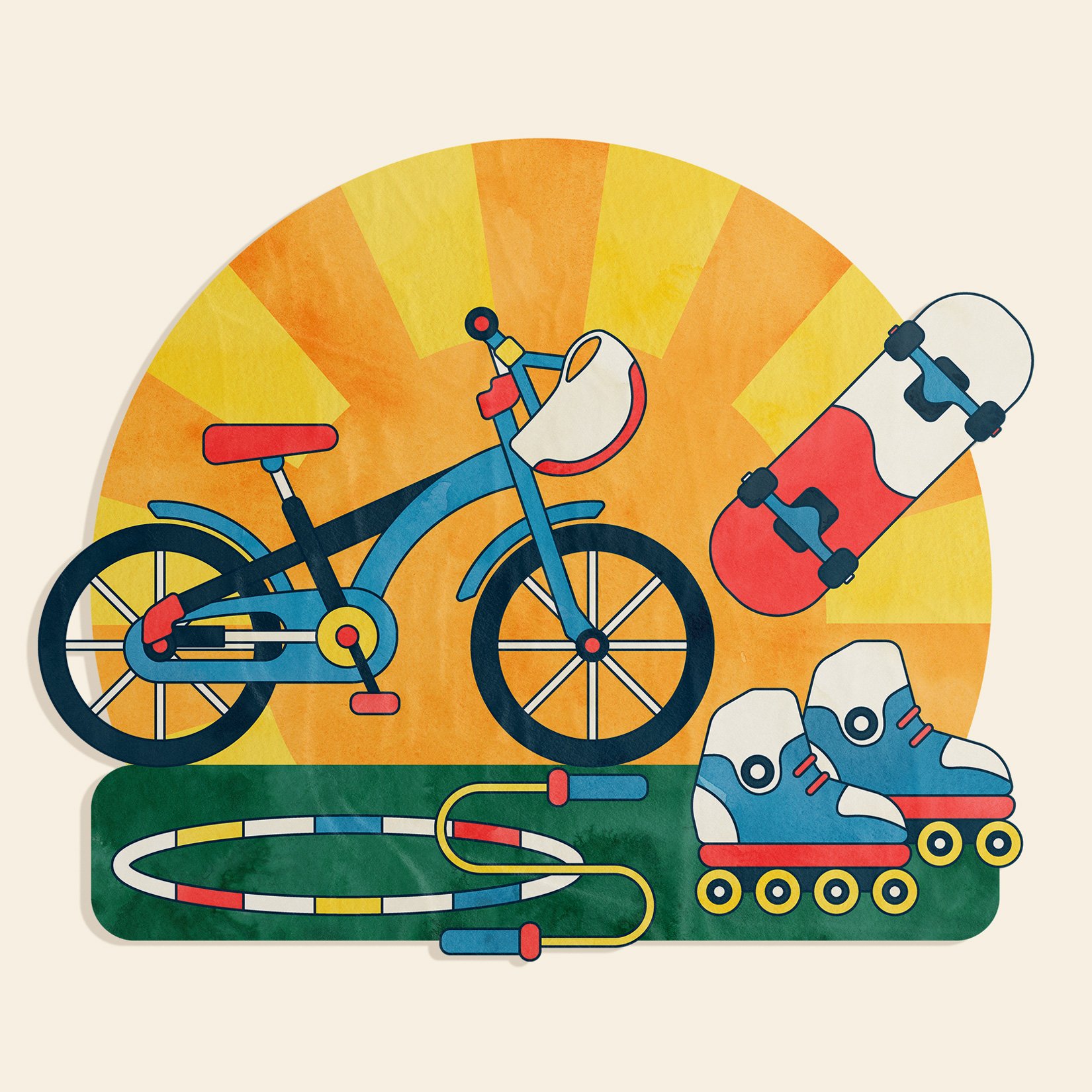
We also brainstormed content for the illustration series. We decided that the artwork needed a brightly colored, youthful look and had to show a wide range of distinctly Maine and nutritious, “grab-and-go” type foods. They also asked me to showcase summer recreation as part of some food scenes and standalone. For example, we landed on both beach and playground scenes with snacks, as well as foods that were specific to Maine culture and produce like blueberry pancakes, corn on the cob, and ‘Italian’ sandwiches.
INITIAL DIRECTIONS

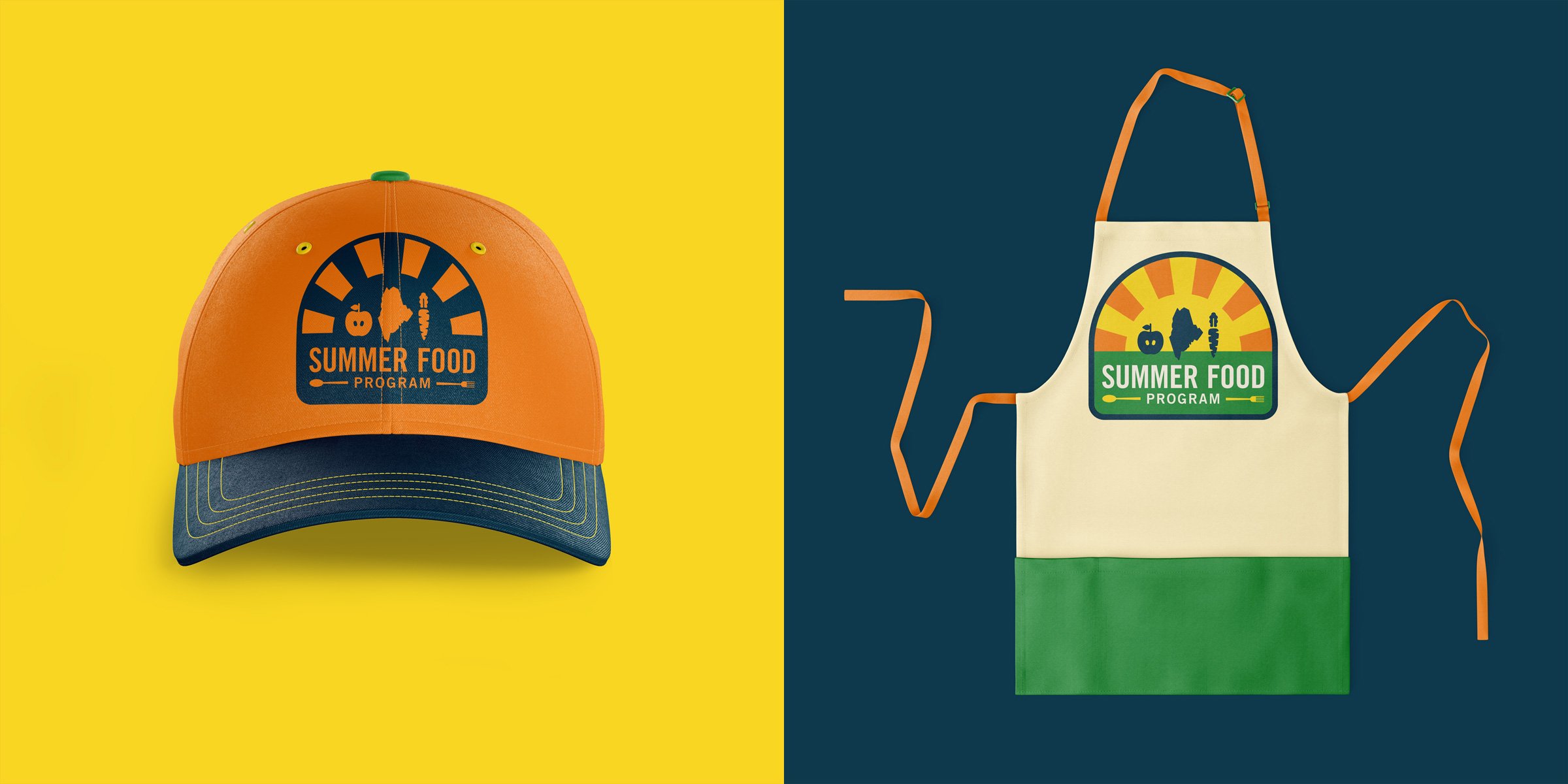
Early sketches explored a range of ways to illustrate food items in a graphic manner that would be easy to apply to collateral, and also give the series a playful, recognizable style. Simultaneously, I worked to develop a new program logo that carried in elements from the original mark which the client felt were important, but also tightened things up, modernized the color palette, and coordinated with the various illustration styles I wanted to present.
LOGO DESIGN OPTIONS

I knew the client felt the book and the carrot from the original mark were essential carryovers, but I recommended bringing in a visual for the state of Maine and swapping the carrot and book for an apple — a widely available Maine fruit that also has a symbolic connection to education. I initially presented the above three logo options. I used clean, bold typography, and found a way to incorporate the utensils without those becoming a focal point. As a recently initiated Girl Scout Troop Leader, I was inspired by scout patches and their connection to summer camp; a Maine childhood classic. I designed a “patch” theme to hold the various elements together and also made sure each mark could work in both full- and one-color reproductions for various use.

ILLUSTRATION STYLE OPTIONS
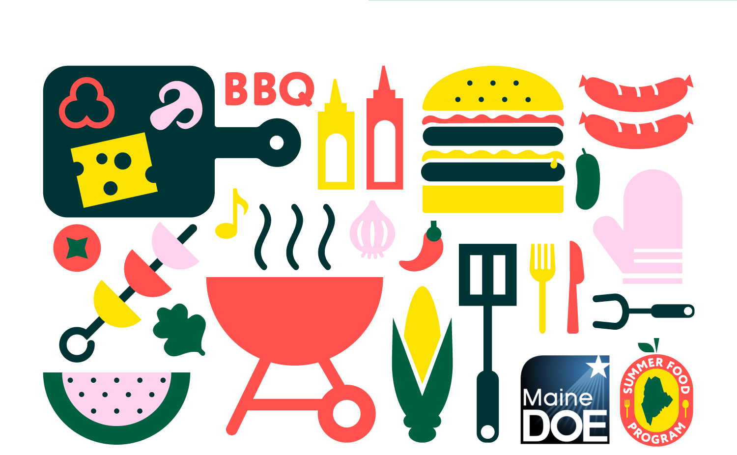
I simultaneously shared three different illustration style options (based on a “backyard cookout” theme) that could be paired with each draft logo direction.


FINAL OUTCOME
After the client approved a logo and illustration style direction, I made some design tweaks to and finalized the logo with various formats optimized for screens and print reproduction. I also created brand visual identity guidelines to aid the client’s team with implementation.
I extended the chosen illustration style to the full series of 9 scenes intended for use on various collateral and food pickup locations. Detailed elements from the final project are showcased below and can also be seen in my branding portfolio, here.