Case Study: Brand Update for Michael Phelps Foundation
THE ASK
Design a new logo and updated visual identity system for world-renowned swimmer, Michael Phelps’ life-saving nonprofit organization.
THE OLD LOGO
The original logo from 2008 had a cumbersome horizontal layout and legibility issues. Because of the ‘reversed’ white-on-navy text, at times it was expensive to reproduce on apparel and other program materials. Conceptually, the design heavily focussed on Foundation’s connection to water which, while still a fundamental element, was no longer the sole focus of the organization. The client wanted a fresh design that maintained not only their affiliation with Michael, but also reflected their mission of “promoting water safety, healthy living, and the pursuit of dreams.”
KEY WORDS
As part of the initial strategy and research phase of the project, the client and I identified the following key words to drive the brand update: Michael Phelps, Water Safety, Healthy Living, Pursuit of Dreams, Community, Youth, Inclusiveness, Strength, Self-confidence, Mental Health, Movement, Swimming / Pool, and Water / Waves.
INITIAL CONCEPTS
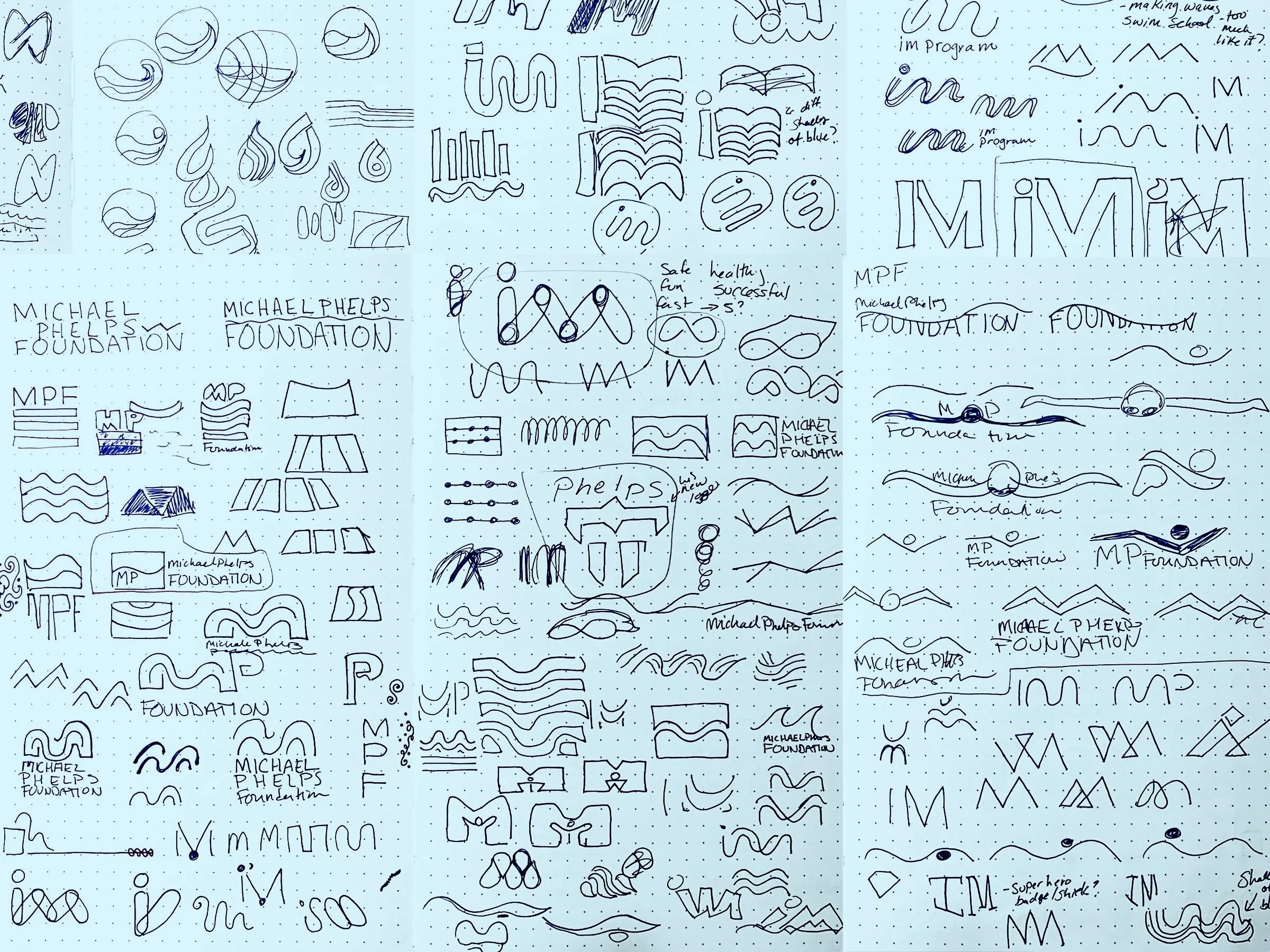
Early sketches included several takes on evolving the water concept, including combining the “M” in Michael with waves which felt like a natural solution. I also toyed around with water droplets and life preservers. I drafted a few “superhero” marks to convey a sense of valor and self-confidence for the Foundation’s ties to the Special Olympics and their mental health programming. I explored potential shapes made from swimmers’ body parts — arms, legs, swim cap — and even tried ‘connecting the dots’ with swimming pool lanes.
Once I exchanged pigment for pixels, the early drafts of the logo narrowed down some key themes. One direction in particular started to rise to the top; incorporating water into a yin and yang shape; a universal symbol of balance and harmony.
Several rounds of refinements followed suit. Typographic explorations happened simultaneously. While we initially planned to stick with the original monochromatic blue color palette, the client requested we incorporate green as a nod to their expansion into mental health awareness initiatives. At one point I was determined to include a gradient, but luckily — and with challenges of the old logo in mind — I was convinced that was impractical and would quickly appear outdated.
THE FINAL DESIGN
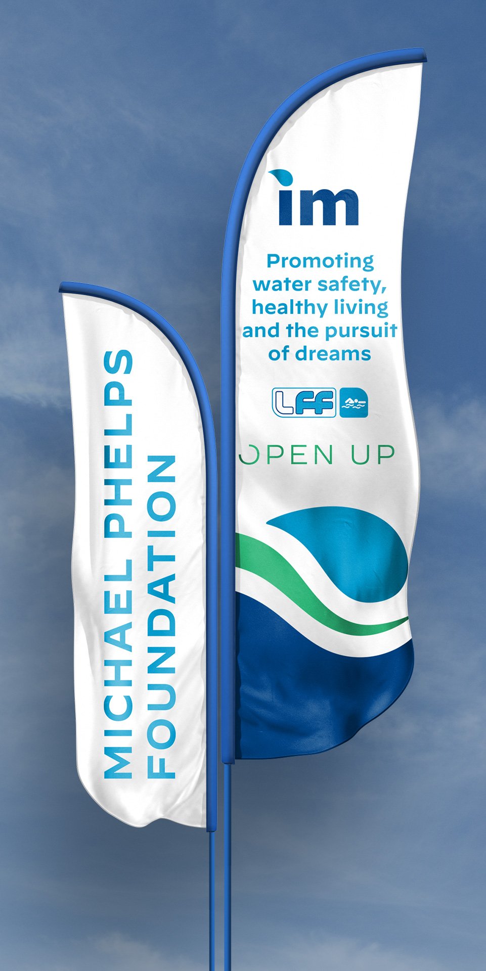
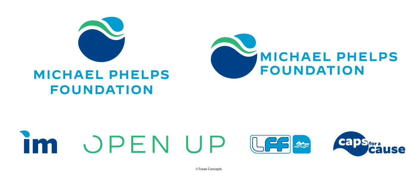
Once a final logo lockup was approved, we expanded the design into a horizontal variant (optimized for digital headers and some signage) and developed a series of icons for use on social media and product swag. We also developed updated and coordinating logos for the various Programs of the Foundation: IM Program, OpenUp, Level Field Fund, and Caps For A Cause.
Key features of the final design include the following:
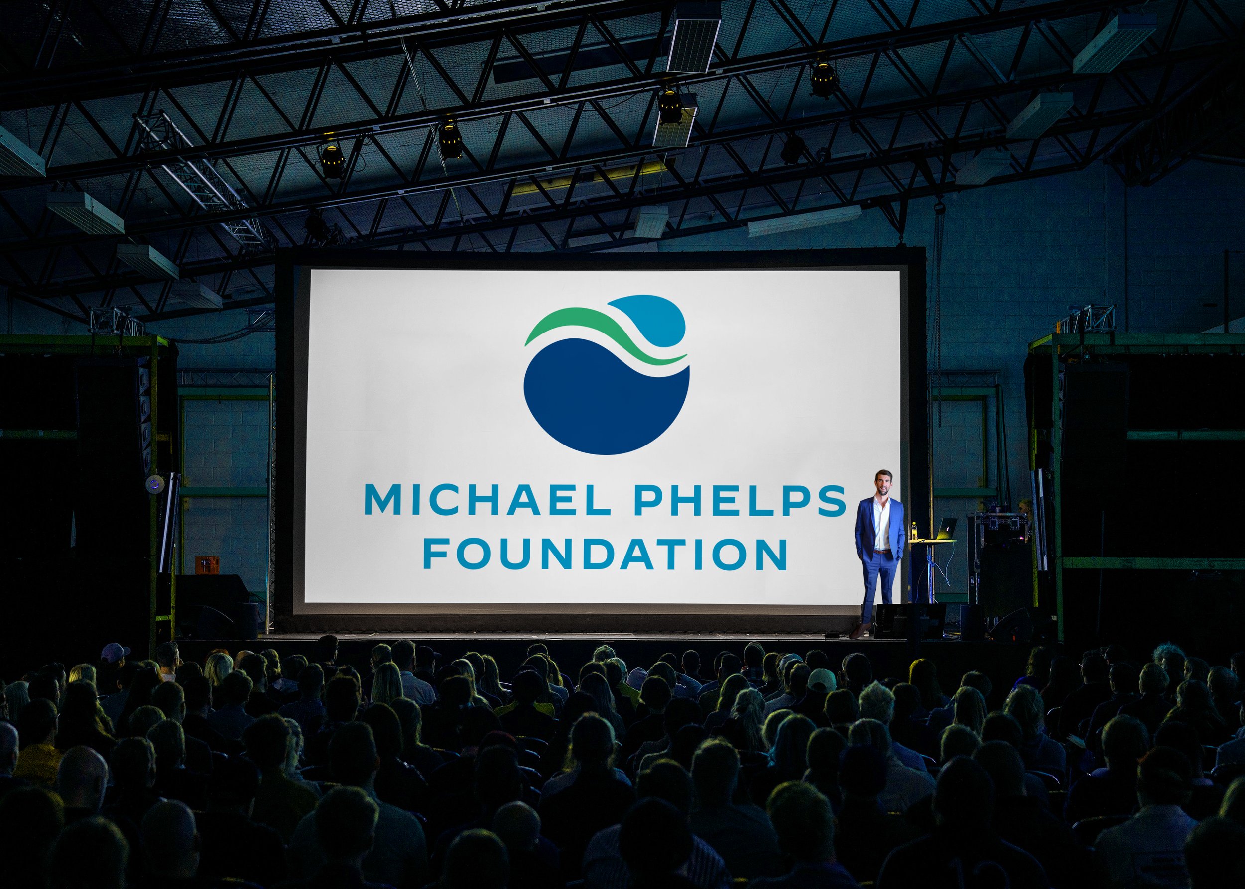
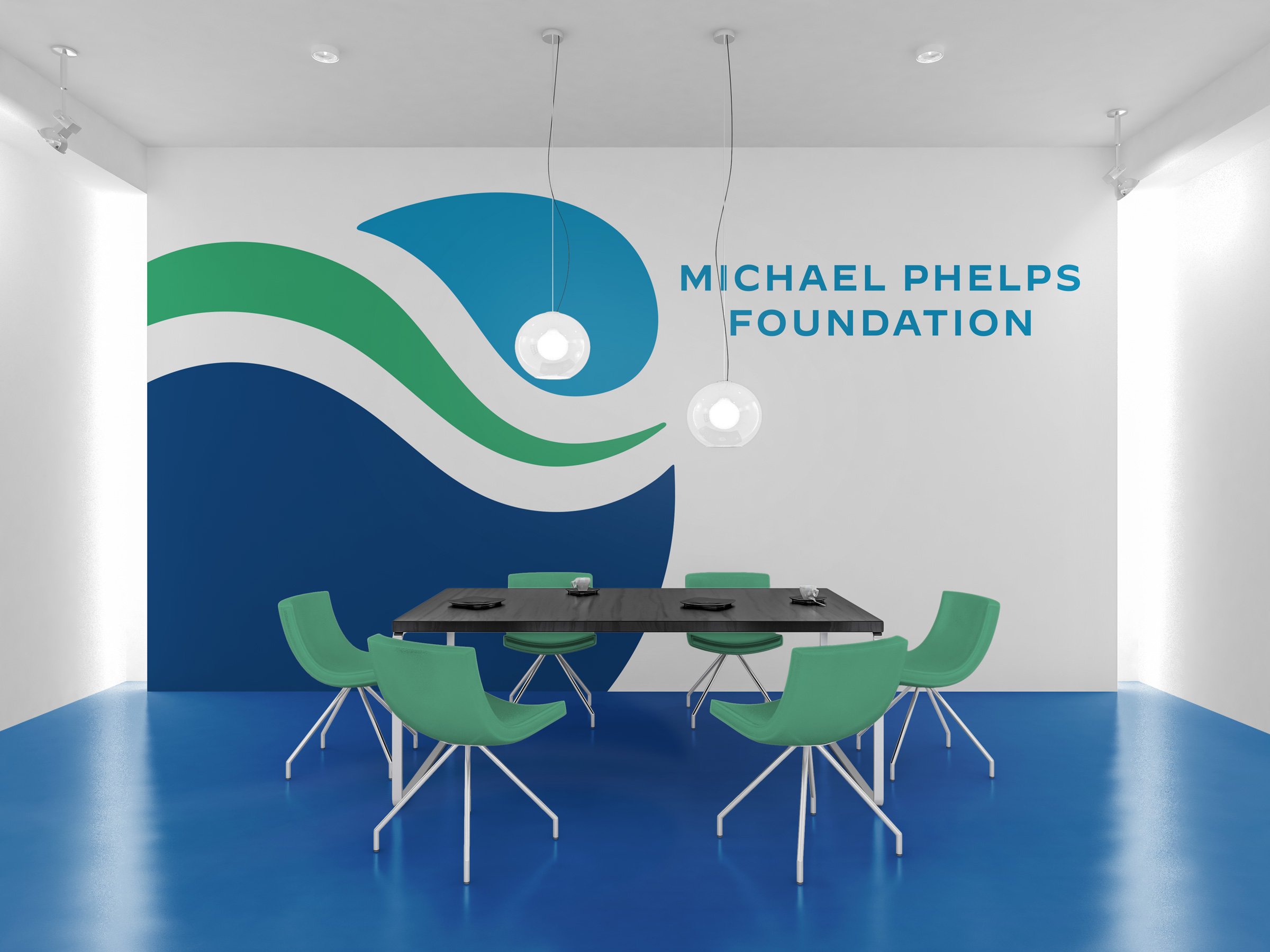
A small, lighter blue water droplet doubling as the “head” of a swimmer; this ties to several aspects of the brand: swim caps, mental health, and the Foundation’s recent 10-year anniversary graphic which featured droplets of water.
A green wave shape doubling as the “body” of a swimmer. This is also symbolic of a path or journey.
A large, darker blue wave/water droplet anchoring the mark with a strong foundation; a core principal of the organization’s programming. It also serves as a blatant reference to the yin and yang symbol.
A clean, contemporary typeface that’s easy to read and well-balanced, with geometric contrast to the symbol.
An updated color scheme evolving the existing brand palette to include green; a recognized color for mental health awareness.
BRAND GUIDELINES
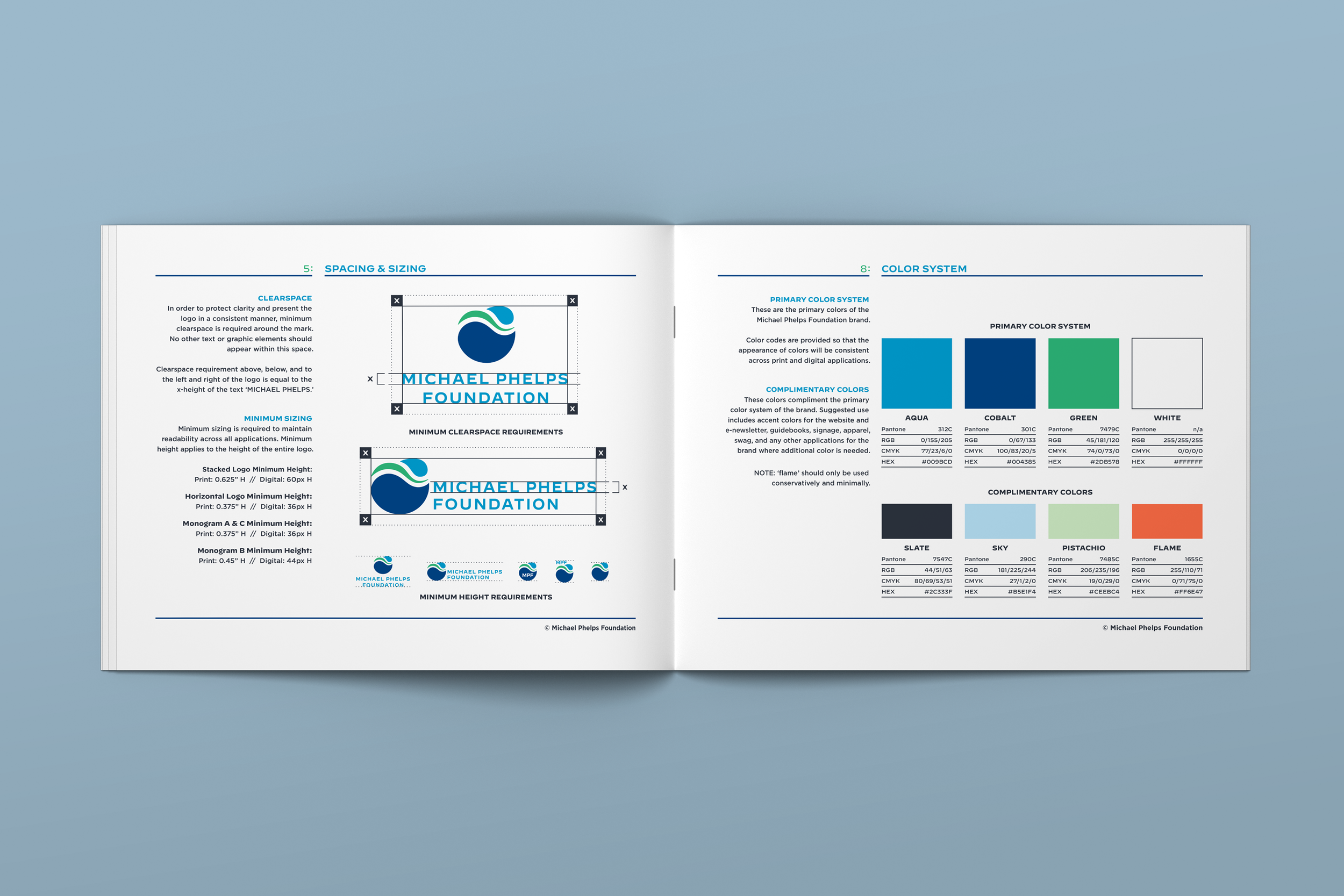
With the final logo established, we developed a multipage Visual Identity Guidebook for the client, depicting the new logomarks, accompanying program logos, color palette, typography system, and best usage guidelines. These guidelines have been a helpful tool for the client to maintain brand consistency across all channels when working with other third-party vendors. This gives the brand a professional, recognizable identity after it ‘leaves the nest.’
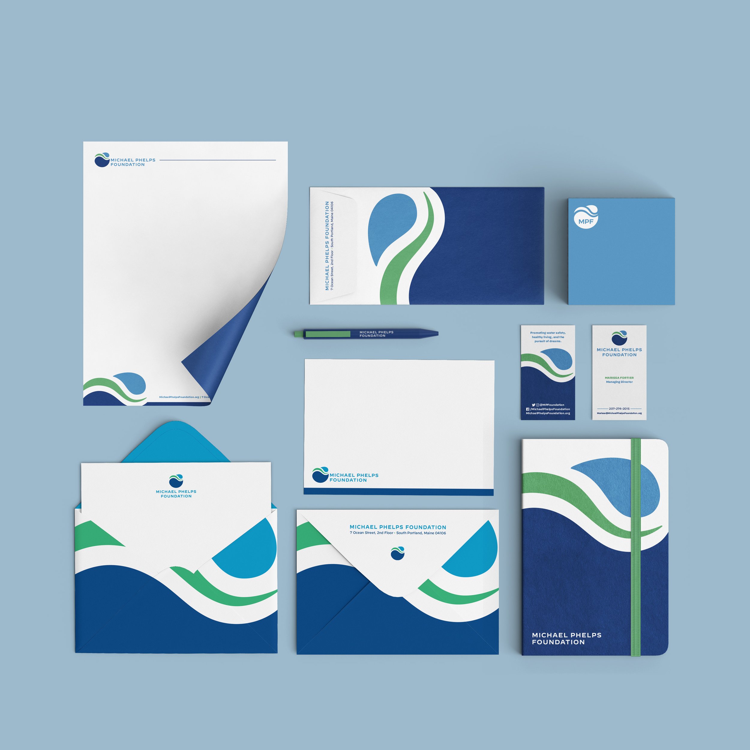
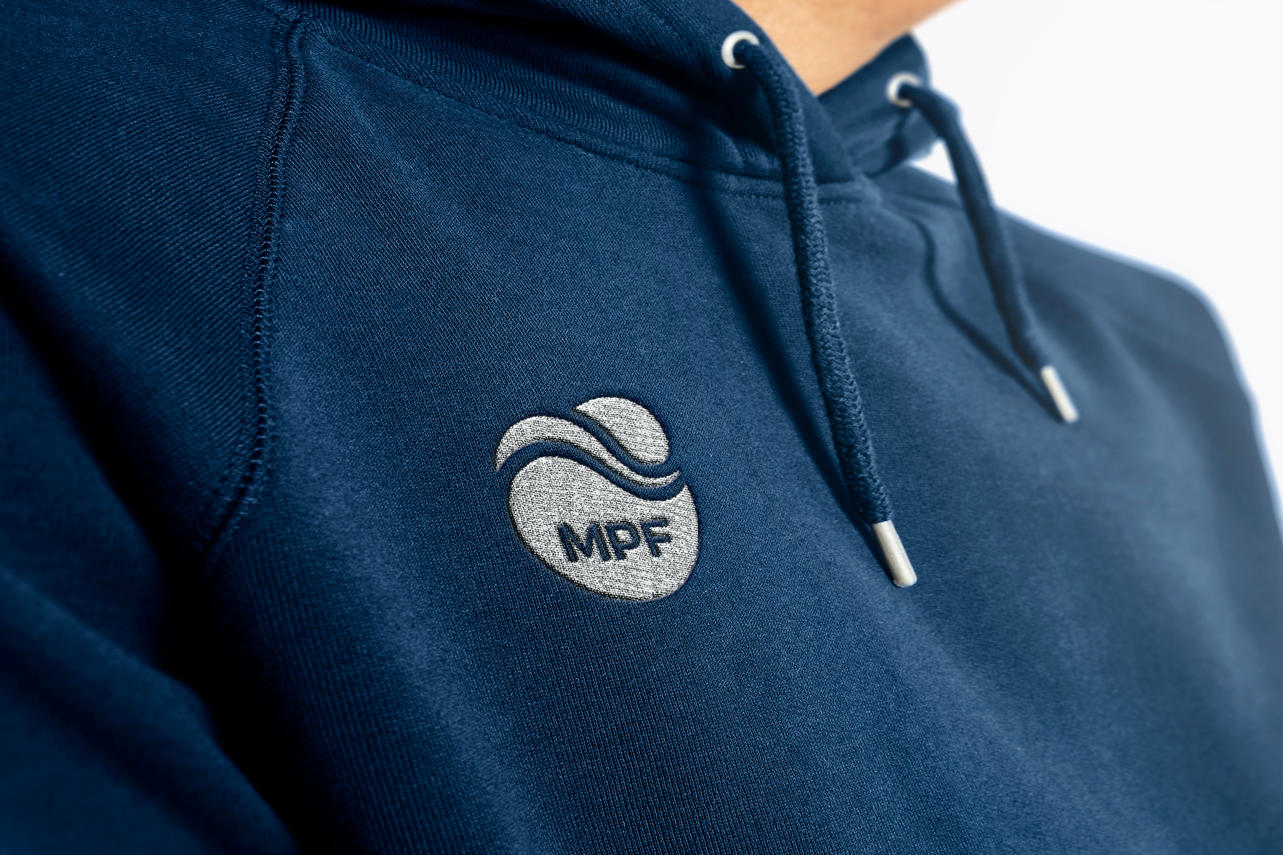
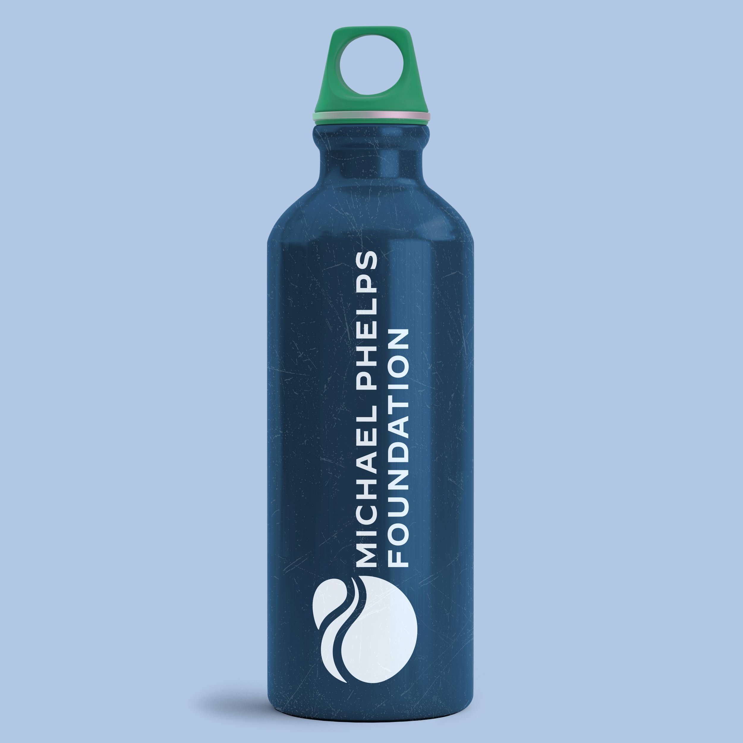
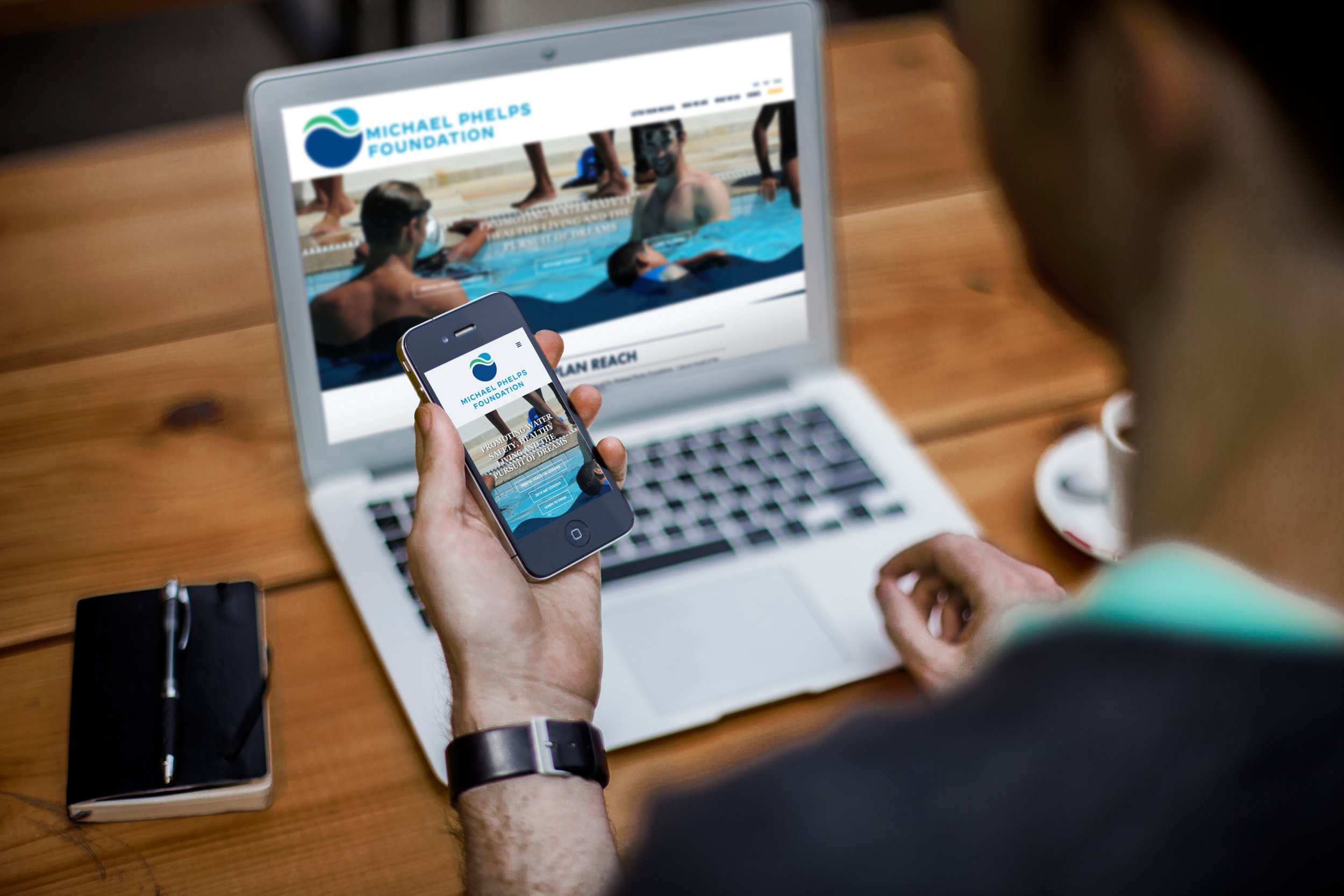
In addition to developing the new brand, we designed an updated brand stationery suite, business cards, signage, digital newsletter templates, event graphics, training manuals, and other marketing and outreach materials which can be viewed in part below. Additional information and imagery from this project can be seen by clicking here.
